Gatsby のサイトにダークモードを実装する
Sun Oct 18 2020
2021 6/9追記 light mode 好んで使う人おる??という気持ちになったので、本ブログからは light mode へ切り替える toggle は削除しました。 一方で下記の方法は現時点までは少なくとも機能していたので残しておきます。
オタクは黒が好きなので、ダークモードを実装しました。 ただ、世の中の全ての人がオタクとは限らないので、ダークモードを ON/OFF できるようにしました (デフォルトはダークモードです…)。
作業工程
プラグインの追加
gatsby-plugin-dark-mode を使いました。
npm install gatsby-plugin-dark-mode
gatsby-config.js にも追加します。
css の設定
gatsby の gatsby-starter-blog を使っていると既に --color-primary などが設定されているので、これらに値を設定していきます。 light モードは body.light、 dark モードは body.dark で指定します。
style.cssbody.light {
  --bg: #efefef;
  --color-primary: #005b99;
  --color-text: #2e353f;
  --color-text-light: #4f5969;
  --color-heading: #1a202c;
  --color-heading-black: black;
  --color-accent: #d1dce5;
}

body.dark {
  -webkit-font-smoothing: antialiased;
  --bg: #101010;
  --color-primary: #ffa466;
  --color-text: #d1cac0;
  --color-text-light: #b0a696;
  --color-heading: #e5dfd3;
  --color-heading-black: white;
  --color-accent: #2e231a;
body.light の配色はもともと使われていた値、 body.dark は #ffffff から body.light の各値を引いたものにしてみました (気が向いたらあとで変えます)。
トグルボタンの実装
以下のように実装しました。
{numberLines:import React from "react"
import { ThemeToggler } from "gatsby-plugin-dark-mode"
import { Switch } from "@material-ui/core"

const ThemeToggleButton = () => {
  if (typeof window !== "undefined" && !localStorage.getItem("theme")) {
    window.__setPreferredTheme("dark")
  }
  return (
    <ThemeToggler>
      {({ theme, toggleTheme }) => (
        <div>
          <Switch
            onChange={e => toggleTheme(e.target.checked ? "light" : "dark")}
            checked={theme === "light"}
            color="primary"
          />
          Light mode
        </div>
      )}
    </ThemeToggler>
  )
}

export default ThemeToggleButton
6-8行目: gatsby-plugin-dark-mode は localStorage.theme に {dark, light} を保持していて、その値を元に body.dark か body.light を読み込みます。しかしプラグインは light がデフォルトになっています… node_modules/gatsby-plugin-dark-mode/gatsby-ssr.js を眺めると、
node_modules/gatsby-plugin-dark-mode/gatsby-ssr.js...
  function setTheme(newTheme) {
    if (preferredTheme && document.body.classList.contains(preferredTheme)) {
      document.body.classList.replace(preferredTheme, newTheme)
    } else {
      document.body.classList.add(newTheme)
    }

    window.__theme = newTheme
    preferredTheme = newTheme
    window.__onThemeChange(newTheme)
  }

  window.__setPreferredTheme = function(newTheme) {
    setTheme(newTheme)
    try {
      localStorage.setItem('theme', newTheme)
    } catch (err) {}
  }
...
となっていたので、 window.__setPreferredTheme を叩けば手動で light or dark を変えられそうです (他にも叩くべきものがありそう…)。 最初の一回だけ dark に変更する必要があるので、 localStorage に theme がセットされているかで最初かどうかを判定したのが 6 行目です。 ただし、 localStorage は develop 環境では存在するので gatsby develop では if (!localStorage.getItem("theme")) で動くのですが、 build 時は localStorage が存在しません。以下が関連する issue です。 https://github.com/gatsbyjs/gatsby/issues/309 これを回避するため、 typeof window !== "undefined" && ... を追加しました。
このように作成した ThemeToggleButton を他モジュールで読み込めば設置できます。
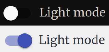
結果
↓こんな感じのボタンが追加されるはずです。